Quick: Fetch Me Some Helvetica Neue!
By Stewart Schley
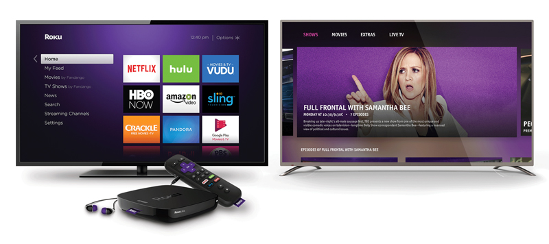
User interfaces introduced by Comcast (top), Roku (above left) and Turner Broadcasting (above right) share similar visual characteristics including bright typefaces against dark backgrounds.
Modern-Day Television UIs Tend to Look More Similar Than Distinctive. Here’s Why.
Given the quickening deployment of digital video platforms, it’s all but certain that somebody, somewhere will launch a promising new addition to the category within the next, let’s say, three months. It may be a documentary/ non-fiction SVOD service, like CuriosityStream. It may deliver a steady dose of Japanese animation, ala Otter Media’s Crunchyroll. Or it may follow in the footsteps of Sony’s Crackle or CBS’s All Access by presenting a mix of scripted and reality series.
We can’t predict what the Next Big Thing in video will revolve around from a content standpoint. But one aspect we can all but bank on is what its user interface will look like on the screen: lots of sans-serif type set against a dark background.
The prevailing motif for the visual presentation of video services that end up on the TV set is notable for its uniformity. From Roku to TiVo to Apple TV to Comcast’s Xfinity X1, modern-day video UIs are cut from a relatively narrow cloth in terms of visual display.
It’s not for lack of will or creativity that many video services appear to be rendered from a copycat formula. It’s mainly that limitations of television screen displays constrain the range of typography, color palette and screen dimensions designers can use to create distinctive UIs. That, plus the tendency among platform developers to encourage the use of pre-fabricated design templates, limits how far designers can go.
Consider typography. Line up the on-screen UIs from Roku, Apple TV and X1 (along with others) side-by-side and you’ll observe a neat symmetry: each screen makes use of clean, elegant typefaces that borrow from elements of the familiar Helvetica family of fonts. Apple’s signature on-screen font, San Francisco, is a close cousin to Roboto Condensed, the typeface favored by Google for its Android TV platform. TiVo’s adoption of Helvetica Neue, a thinned-down variation of the mothership font, makes the TiVo look similar to Roku’s on-screen UI from a typography standpoint.
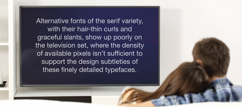
The reason: alternative fonts of the serif variety, with their hair-thin curls and graceful slants, show up poorly on the television set, where the density of available pixels isn’t sufficient to support the design subtleties of these finely detailed typefaces. “Generally for TV displays serif fonts get blurred out, and that can affect readability,” says David Polensek, a senior UX designer for the media software firm Alticast.
Type sizes can be limited, too. Designers whose creations will end up on a traditional TV screen recognize they’re designing for a viewing range of around 10 feet or so — the presumed distance between screen and couch. Generally, type characters any smaller than 16 pixels can compromise legibility on TV screens. So can typefaces — even of the sans serif variety — that are especially skinny. “Sometimes a font can fall in between pixels so you have to go with a slightly thicker font. Too thin can actually break up on the screen,” comments Joel Greiner, a UI designer for Ottawa-based media app developer You.I TV.
Then there’s background imagery. For mobile devices like smartphones and tablets, designers have a wider range of choices thanks to high-contrast lighting environments. Black type on white screens is common for text-centric online publications (think Politico or Medium), but rare in living-room environments where the presumption is that subdued indoor lighting prevails. “In the living room, imagine a situation where it’s 9 o’clock in the evening, the sun’s gone down, and you get blasted with a white screen,” says Greiner.
In television UIs, even though HD sets can display more than 16 million colors, the common default is a bright typeface against a dark background. X1’s imposition of a thin white font against a near-black background is a signature example. So is Roku’s telltale purple background behind a white sans serif typeface. Turner Broadcasting’s new UIs for its TV Everywhere offerings (created by You.I TV) also employ dark surfaces that give visual “pop” to white lettering.
Also constricting designers, albeit to a smaller extent, is the TV set display approach known as overscan that limits the available real estate on a screen. The well-worn print design technique of “violating” page borders with artwork that gives the illusion of extending past the margin is off-limits to television UI designers. That means type characters and fixed art elements must live inside the TV screen’s edge boundaries.
A final impediment relates to audio effects. Depending on the audio capabilities of the set-top device that’s used, it may be impossible or at least difficult to add chimes, dings and tones in a graceful way. Sometimes doing so can unintentionally mute the video content that’s playing, points out Alticast’s Polensek, who has led UI design initiatives for providers including Canada’s Rogers Communications and Shaw Communications. “I’m a big proponent of audio, but it’s difficult to do well,” he says. You.I TV’s Greiner agrees, pointing to TiVo as an early pioneer with its signature upbeat tones and noises. “They used audio in a way that nobody else did,” he says. “That’s one big thing that’s missing in UI today.”
TV-first design
Because of these limitations, there’s a temptation to create differing versions of UIs for the living room vs. mobile and/or PC environments. But most designers conclude the smarter strategy is to play to the entrenched display technology that is the TV set, and make mobile variations look and feel largely the same so that users experience a seamless encounter regardless of device. This may be a lower-common-denominator strategy, but it’s supported by research showing the TV set remains the dominant screen for video viewing. A recent report from Adobe, synthesizing more than 16 billion TV Everywhere viewing sessions, found the majority occurred over a TV set, not a smartphone or PC. In its software developer’s kit for the Apple TV platform, Apple advises re-thinking design for the TV set environment. “We need to unlearn the intimacy of both mobile and desktop and adapt new patterns,” Apple suggests.
This isn’t to say creative variations in TV-based UIs are rare. A new generation of UI designers is making the most of the craft in part by exploiting interactive dimensions of TV UIs. The manner in which content choices are presented, layout grids are arranged, menus expand, transitions occur, sounds materialize and objects animate varies widely among video UIs even as color and typography similarities prevail. Even the failsafe approach of bright type on a dark background sometimes gives way: Greiner notes that for kids’ content, which tends to be viewed during daylight hours, designers are experimenting with lighter screens and darker type.
Going forward, there are reasons to believe more leeway, not less, will be the rule. A hoped-for movement away from CSS3, JavaScript and HTML-based programming to a uniform core code layer promises to liberate designers from template-bound restrictions. Also, the migration to 4K video resolution will remove some of the display impediments that currently limit choices for visual presentation. Who knows: Serif fonts may have a role to play after all.
For now, though, a degree of unintended harmony is generally the rule for TV interfaces. So is a certain stubbornness among platform users. When TiVo transitioned to a new font in 2014, Brighton, U.K. customer Richard Rutton complained in a blog post that “A profusion of Helvetica Neue Light had invaded my Virgin TiVo box…the very worst of Helvetica Neue Light in all its indistinct, tightly tracked, blurry mess.” Some users of Comcast’s X1 also have expressed complaints about legibility: “The X1 guide font is not readable to me unless I get out of the chair and stand in front of the TV,” wrote one user in January on a bulletin board Comcast maintains.
Nobody can expect to please 100 percent of the public, of course. The broader goal is to create a UI that is, as Comcast Executive Creative Director Tom Loretan described X1, “beautiful, visually captivating, easy to scan and voice enabled to accommodate a broader range of customers.” In most cases, a similar aspiration leads developers down a similar design path, leveraging familiar methods of presentation that revolve around relatively narrow choices of color and typography. The likely result: When the next promising SVOD platform pops up in the marketplace in a few months, it may exhibit newfound innovation in content, business model rationale or marketing approach. But what it probably won’t do is look terribly different from its peers.

Stewart Schley,
Media/Telecom Industry Analyst
Stewart has been writing about business subjects for more than 20 years for publications including Multichannel News, CED Magazine and Kagan World Media. He was the founding editor of Cable World magazine; the author of Fast Forward: Video on Demand and the Future of Television; and the co-author of Planet Broadband with Dr. Rouzbeh Yassini. Stewart is a contributing analyst for One Touch Intelligence.


